BY INTEGRATING ACCESSIBILITY,
YOUR ORGANIZATION DEMONSTRATES
A COMMITMENT TO INCLUSION.
By prioritizing accessibility in logo design, organizations not only demonstrate their commitment to social responsibility but also enhance their brand’s reach and impact. It fosters positive brand perception and reinforces the message that the organization values every individual’s right to access information and participate in digital experiences.
As technology evolves and awareness grows, integrating accessibility into every aspect of visual communication not only aligns with legal requirements but also positions brands as champions of inclusivity, paving the way for a more equitable and accessible digital landscape.
SELECT LOGOS
Accessible Writers’ Lab
Focusing on accessibility and screenwriting for television, this program explores possibilities for what an accessible writers’ room could be.
Solution:
We developed a clear, modern logo featuring a bright, stylized and simplified television icon.
Project Scope:
French and English logos, accessible 1 page brand guide.
Keywords:
Arts / TV / Branding / Nonprofit
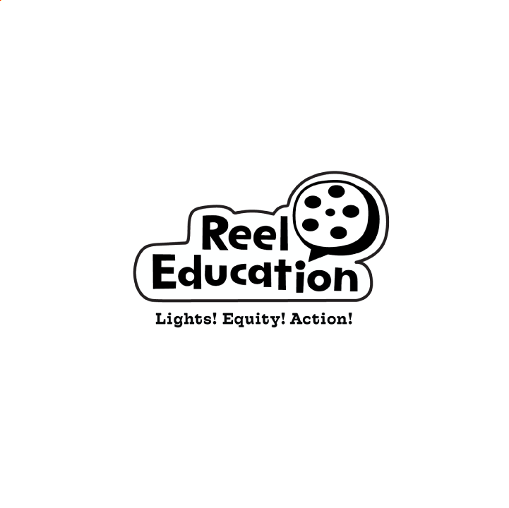
Reel Education
The ReelEducation program provides free resources for educators and administrators to teach students
about disability and Deaf culture through film. Grades K-12 are taught about Inclusion, empathy, universal design, mental health and stereotypes.
Solution:
We developed a playful sticker-style logo with a built-in white background, allowing it to be used as a sticker on bright brand colours and colourful printed materials, ensuring it would stand out.
Project Scope:
logo suite, accessible brand guide.

The Accessibility Exchange
TAE offers valuable resources and guidance to organizations, facilitating connections between the disability and Deaf communities and federally regulated entities.
Solution:
We developed a clear, modern logo with a strong icon. The three intersecting shapes represent the strengthening of communities when the enchange of information is barrier free. A white shape moves between the three, creating a clear path forward.
Project Scope:
logo suite, accessible brand guide, microsite, newsletter.
A collaboration with Accessibrand

ArtsAbly
ArtsAbly’s goal is to improve accessibility in the arts and create an open dialogue between performers, students, and artistic ensembles.
Approach: The client wanted a three-color icon. We went with darker primary colours and designed an open icon shaped like a musical triangle. The openness of the triangle symbolizes access and flow.
Project Scope:
logo suite.
A collaboration with Accessibrand
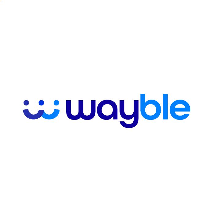
wayble
Wayble enables higher education institutions to scale holistic support & services for international students. The organization drives Nationwide initiatives for the ecosystem partners championing international student success
Approach: We crafted a stylized ‘w’ icon that can be interpreted as people intersecting and connecting, as well as two overlapping smiles. Our objective was to convey themes of unity, fun, support, clarity and connections.
Project Scope:
logo suite.
A collaboration with Accessibrand
The Disability Partnership
An organization dedicated to breaking down barriers, fostering collaboration and creating a strong, united disability community in Nova Scotia.
Approach: We created a fun and energetic logo representing the team’s collaborative and inclusive spirit. The center of the dynamic people icons reveals a star.
Project Scope:
logo suite.
A collaboration with Accessibrand
VRAIE-IDEA
Inclusive Design for Employment Access (IDEA) aims to help employers in Canada improve their capacity to recruit, hire and promote persons with disabilities.
Approach: A modern sans serif logo was created accented with a stylized R. As a graphic complement, we styled the “V” of VRAIE and “I” of IDEA into an icon to illustrate the human connection and growth goals of the organization.
Project Scope:
logo suite.
A collaboration with Accessibrand


